RX CLINIC
Rx Clinic it's a medical app that helps patients to connect with their PCP fast and easy
MY ROLE
UX/UI Designer
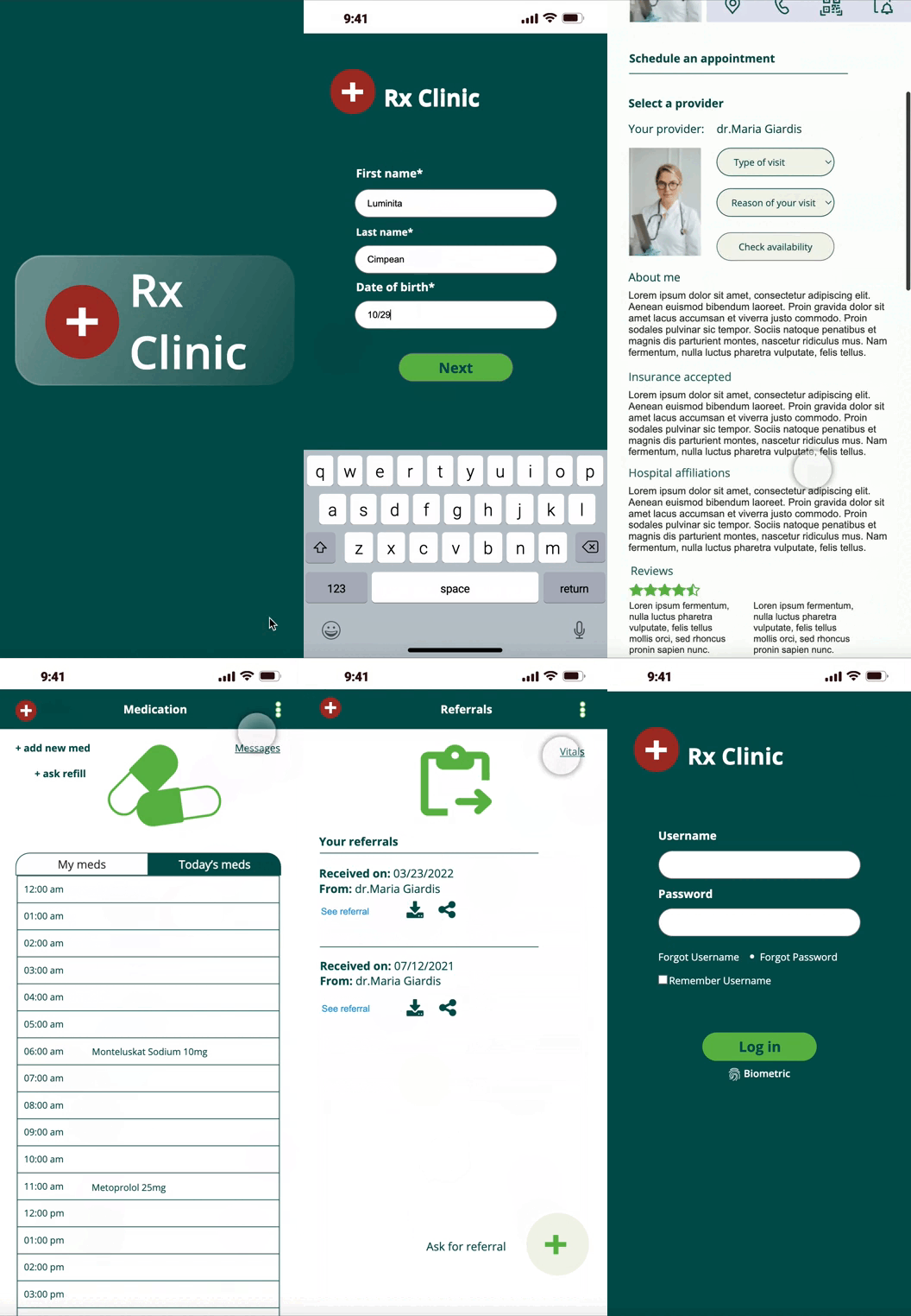
FINAL PROTOTYPE
TOOLS
Figma, Axure
DURATION
6 months

PROJECT SCOPE
This is a medical app created to help a large number of patients to connect with their PCP, track their medication and keep organized their health information.
THE PROCESS
In order to utilize a solution-based approach to my problem, I applied the Design Thinking methodology.
MAKE OF THE TEAM
I'm a paragraph. Click here to add your own text and edit me.
KEY GOAL
Interviews
Competitive analysis
(secondary research)
User persona
Travel journey map
Empathy map
User flow
Mid fidelity
Design system
High fidelity
Feedback

EMPHASIZE
RESEARCH
Developing and hosting any medical app or websites requires to know laws and regulations, so I started my research by reading the legal requirements for Healthcare websites/ apps, as HIPPA’S Standards and HHS requirements.
INTERVIEWS
For a better understanding of the problem, user needs and pain points, I defined two categories of personas: young adult (21 - 33) and adult (34 - 55), and then I conducted 10 interviews.
Insights from interviews
- people need an easy way to communicate with the PCP
- sometimes people forget to take their daily medication
- people would like to have access to lab results or other tests right away
- it will be helpful for them to have all the health records well organized and to have access anytime
DEFINE
PROBLEM STATEMENT
Difficulty of users to get in touch with their PCP right away.
This stage involves synthesizing all the information gathered during the emphasize stage and create the personas, travel journey map and empathy map.
USER PERSONAS
Based on the interviews, I created two user personas that represents the groups of target users I will be designing for.
I used a specific scenario for each persona, to understand how the users might feel while using this app.
TRAVEL JOURNEY MAP
EMPATHY MAP
I created empathy map to gain a deeper understanding of my users behaviors, attitude and needs.
IDEATE
USER FLOW
The user flow helped me to determine the layout and the content of the app.

PROTOTYPE
MID FIDELITY WIREFRAMES
Some of the wireframes I created.


DESIGN SYSTEM

HIGH FIDELITY MOCKUPS


TEST
FEEDBACK
Before starting prototyping, I tested my app with few potential users to get their feedback.
Issue:
Users got a little bit confused because of the two similar screens
Improvement:
Keep just one screen with the complete menu and reorganize the menu according to users preferences
1. Screen with the
most used features
2. Screen with complete menu
Appointments, medication and messages on the first line


THESE ARE SOME OF THE FEATURES THAT SOLVE USER'S NEEDS
1

2
3
1
2
3
4
5
Schedule an appointment in person or online (with Televisit option)
Set up reminder for pills
Sent messages to PCP
All health information in one place
Can add other family member on the same account
4

5
KEY LEARNINGS
- I’ve learned that the choice of colors, typography, impacts the experience of the users. I
- it was a challenge to create a design for all categories of patients, to conduct the user research and prepare the whole flow, in order to create a complete prototype-friendly app with smooth and clear usability for users.
- it was a challenge to find people available for in person interview so the majority of interviews I conducted on zoom


